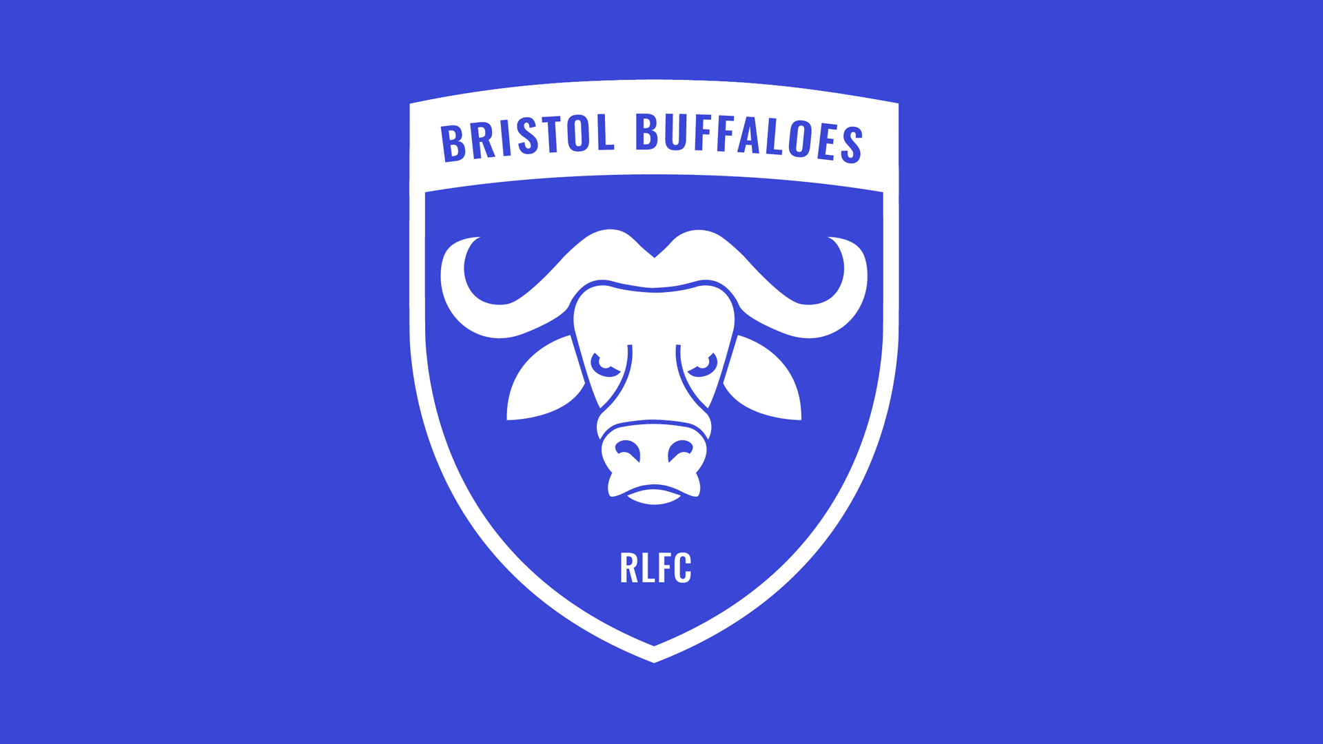
For the logo design I wanted it to have a minimal design style with the icon being the main feature of the design, which could then play a key role independently from the main badge. The shield shape was adapted from the city's coats of arms to create a subtle link to the city.
This is a promotional video for the club launching the logo design. As well as animating the buffalo icon from the logo I experimented with bold typography. I wanted the typography to reflect the powerful nature of a buffalo and made some copywriting that suited these characteristics.
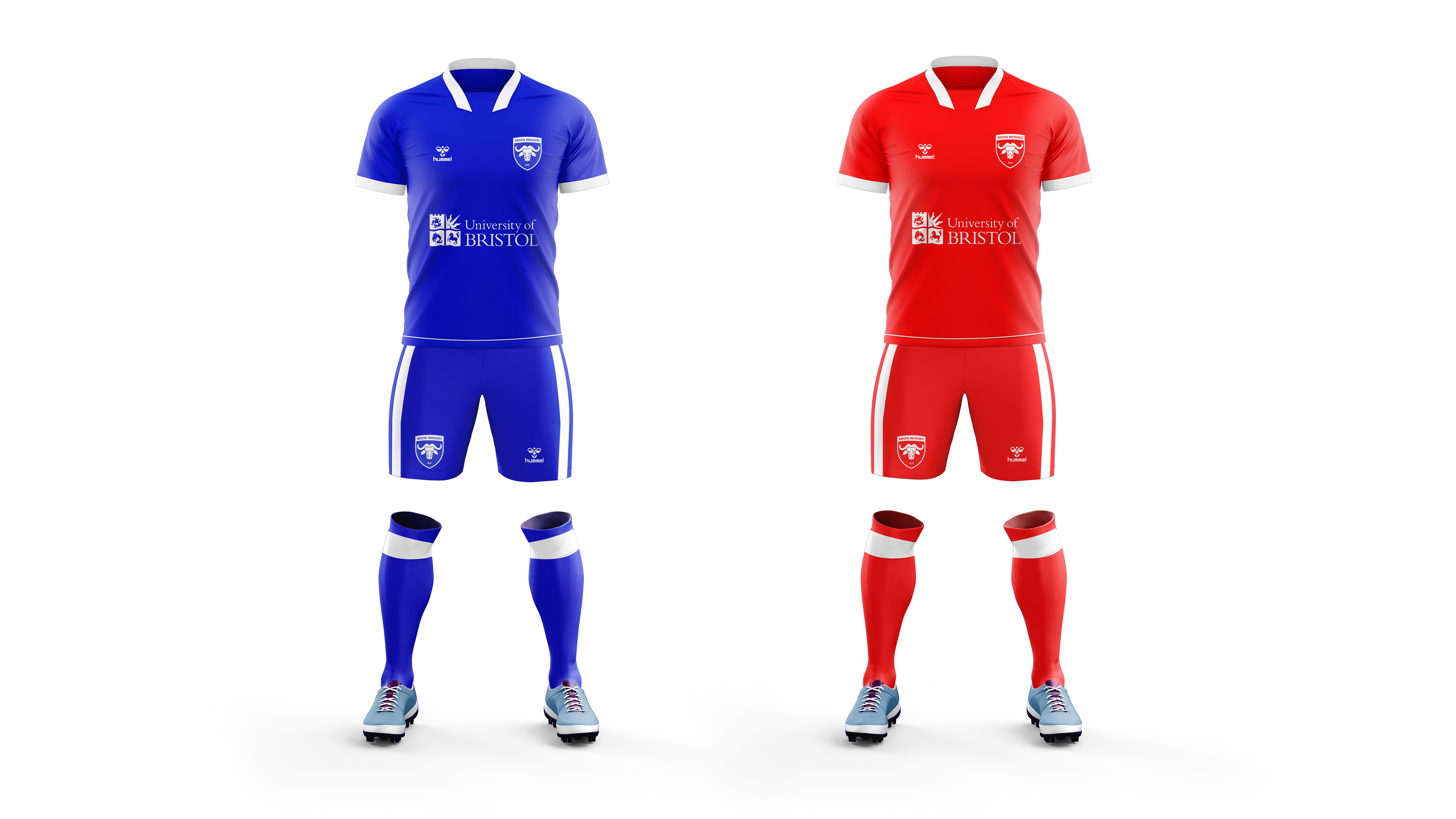
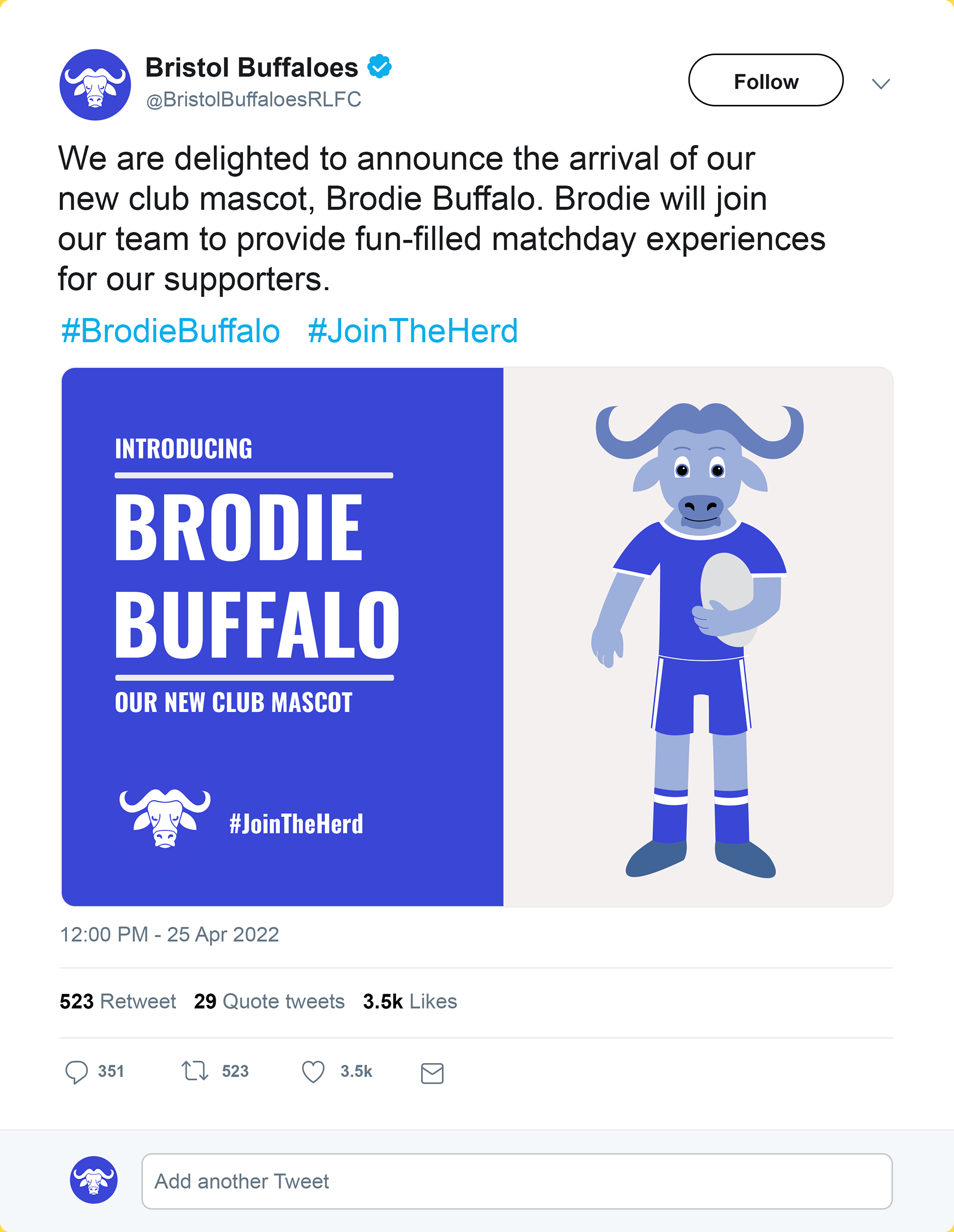
These are some matchday application designs for the kits and mascot. The colours used in the kits are . I also created a mascot for the club to see the identity applied in further contexts.


I wanted to test the design in physical outcomes rather than just as an onscreen vector. This is an important consideration to see how a design adapts. I produced a wooden coaster using a laser cutter as well as working with members of the fashion course to try it embroided.


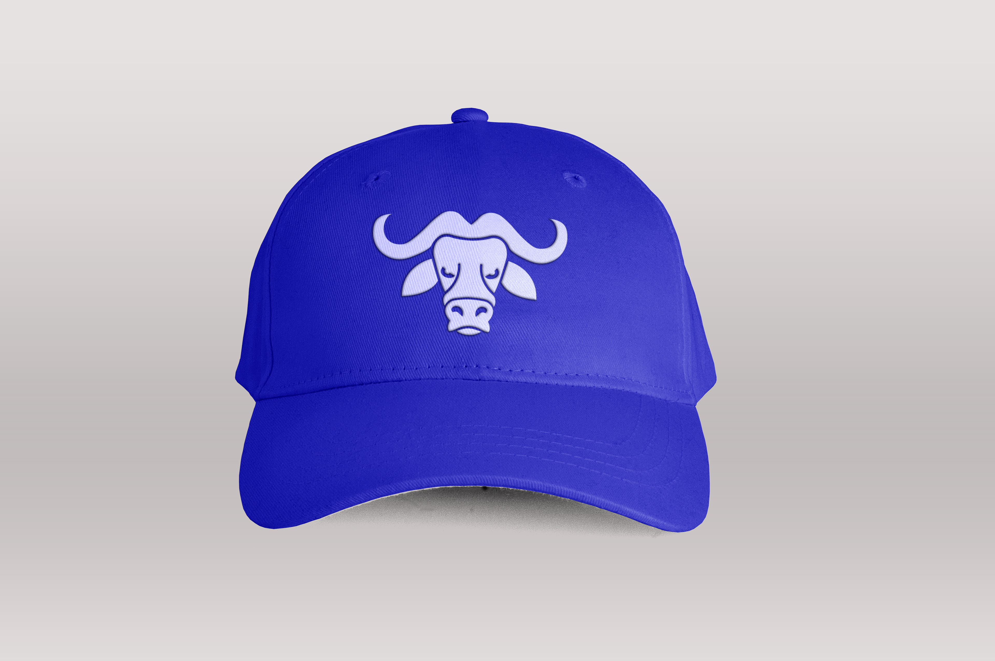
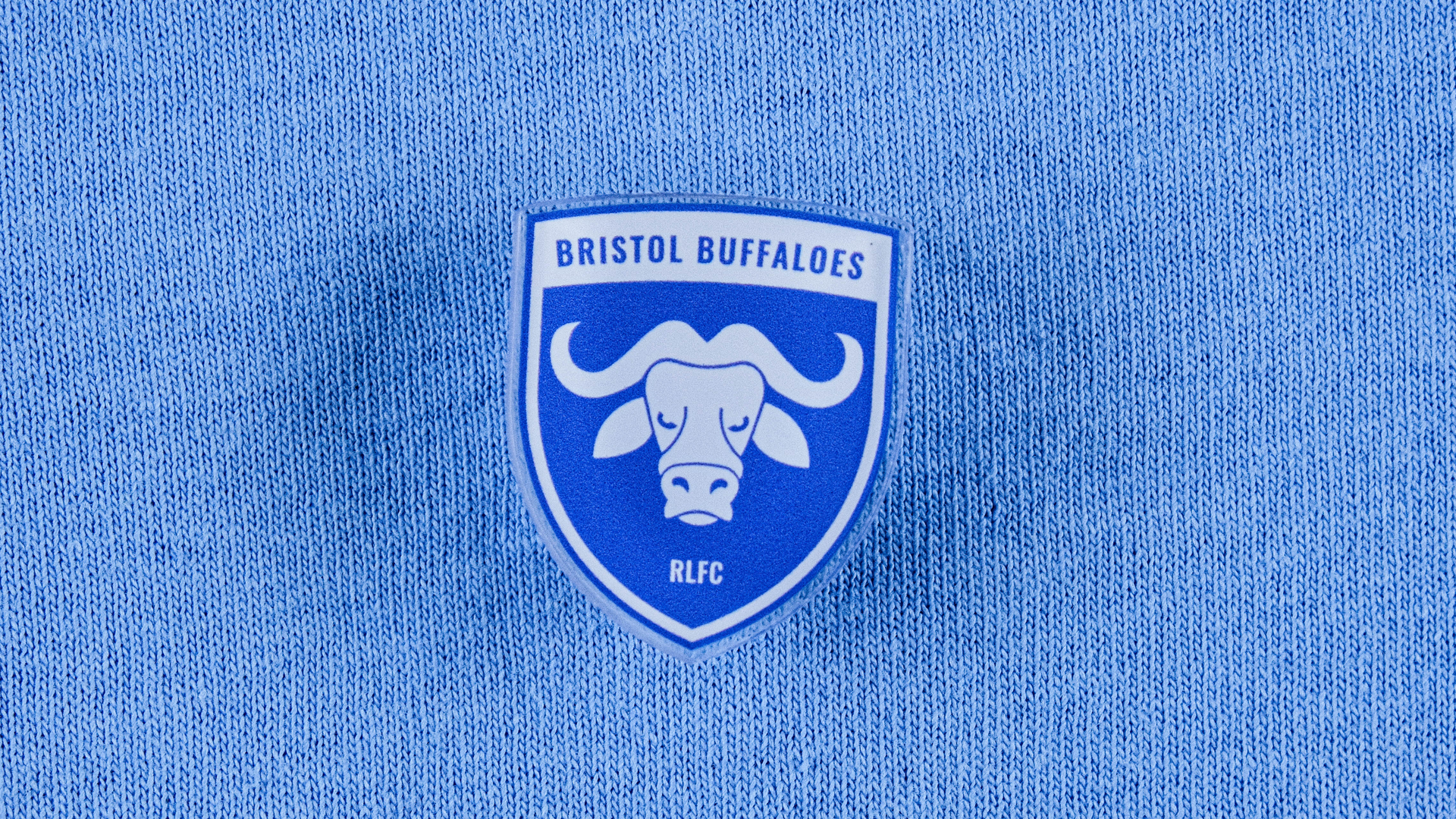
These are some additional examples of how the design can be applied. These show the it being used on a sports bag as well as some acrylic pin badges I got made and used on t-shirts. I also showed how the icon can be used independently on signage and merchandise such as caps.