We created a logotype for the brand that visually showed this eco-friendly personality with the addition of leaves to the type. We wanted it to have a soft and approachable appearance. A shortened logo mark was also produced to work as an icon, which works better for certain products and social media platforms. Making the brand adaptable was an important consideration.
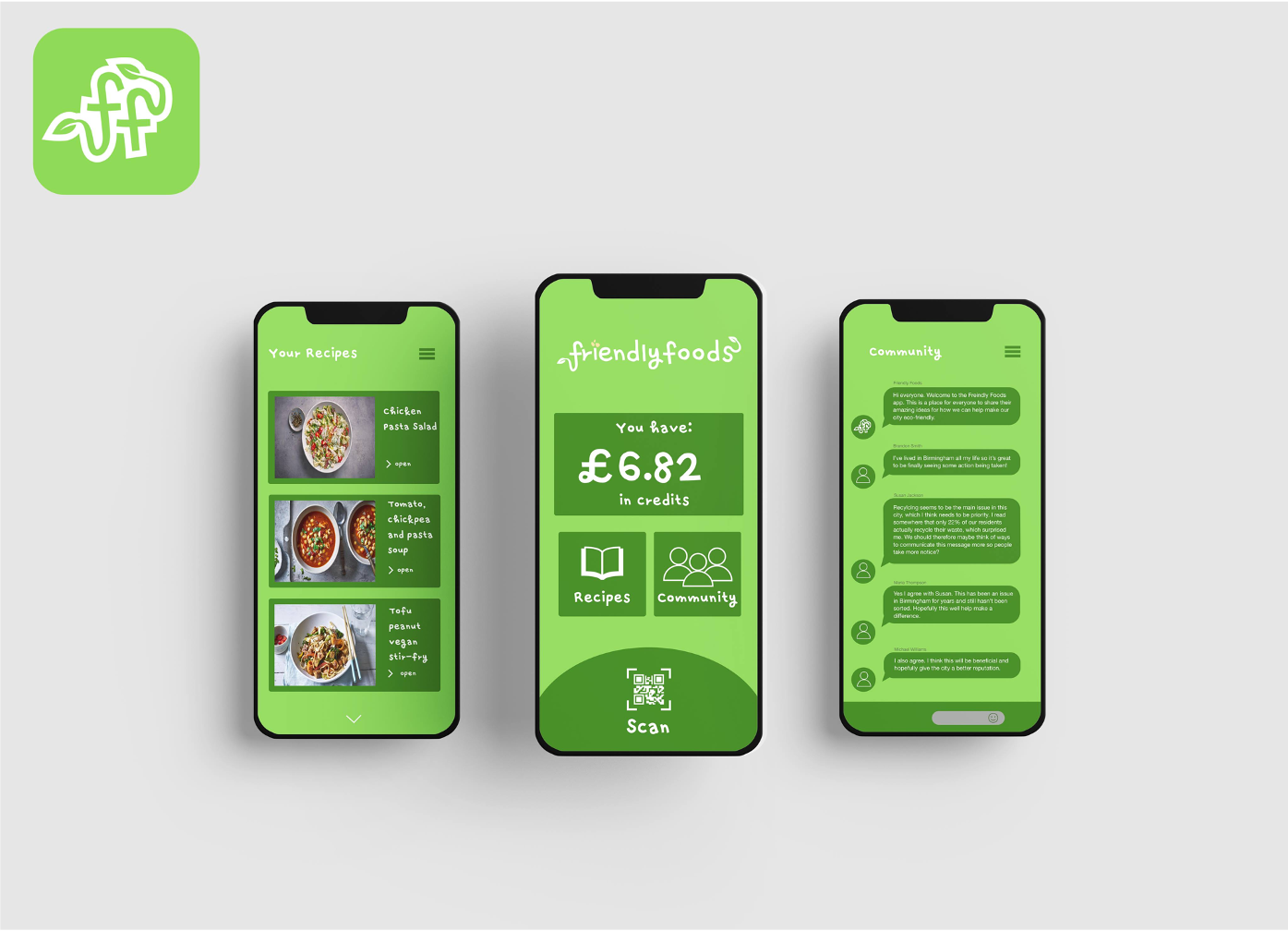
A mobile app was designed to provide further interaction with the community to promote this eco-friendly way of living. It provides the function of being able to scan QR codes on shelves for certain recipes. The customer is then able to download recipes to use themselves. It also has a community section to share ideas as well as credits that you can redeem on purchases.
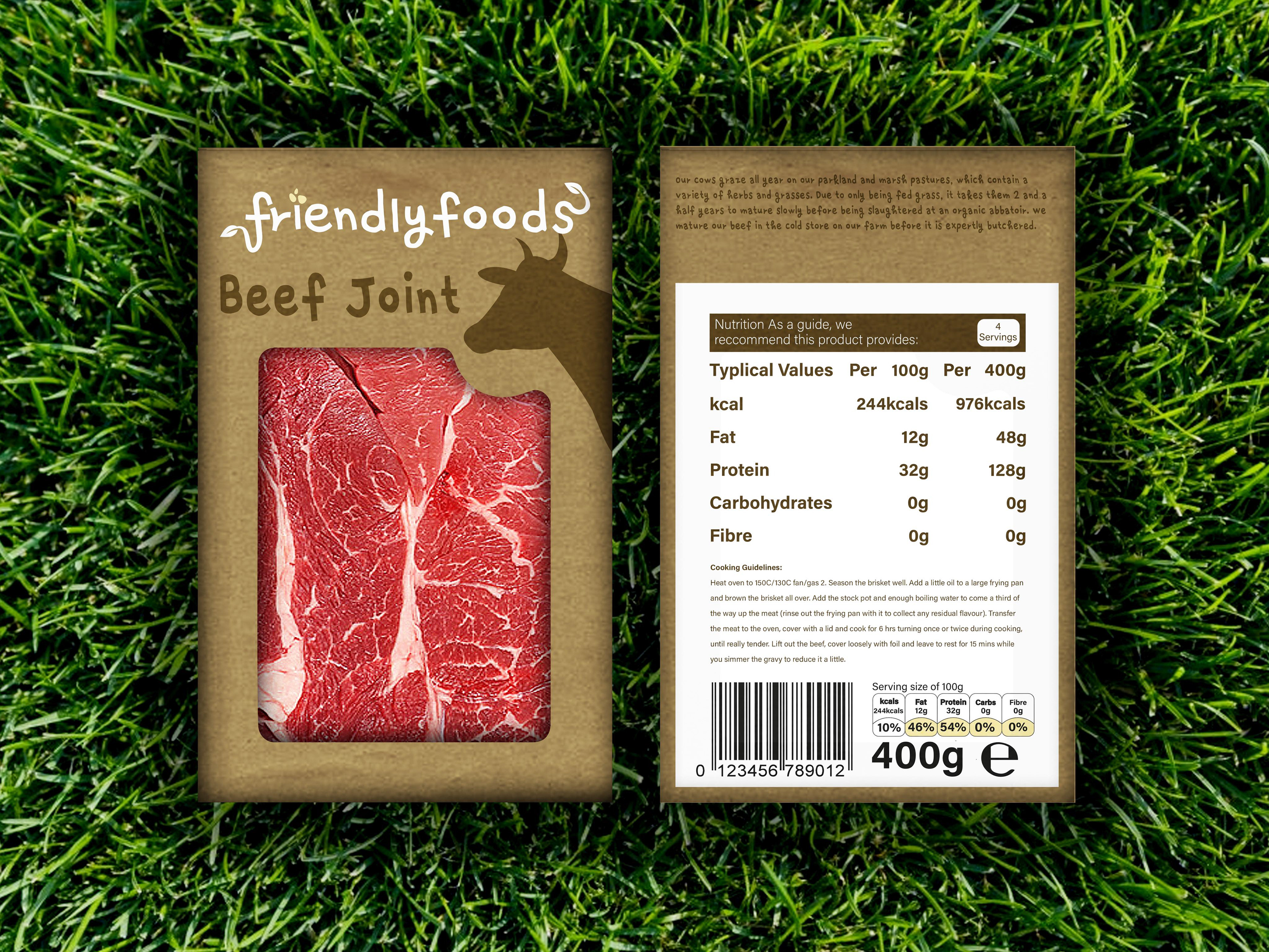
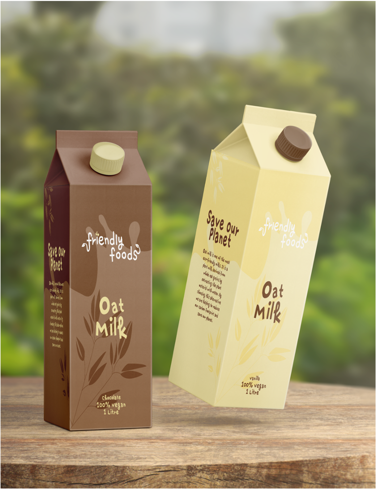
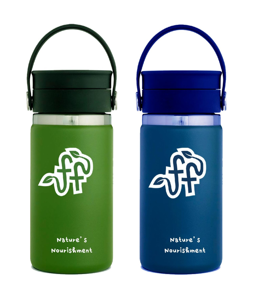
Packaging was designed for a range of products with the emphasis on re-usability. This resulted in eco-friendly material used for sustainability. It also included a re-usable flask as part of a promotional deal to encourage people to waste less bottles and cups .

Out of home advertising was also produced to push the brand into the local environment. This included billboards that re-enforced the local community spirit as well as business cards made out of recycled materials.