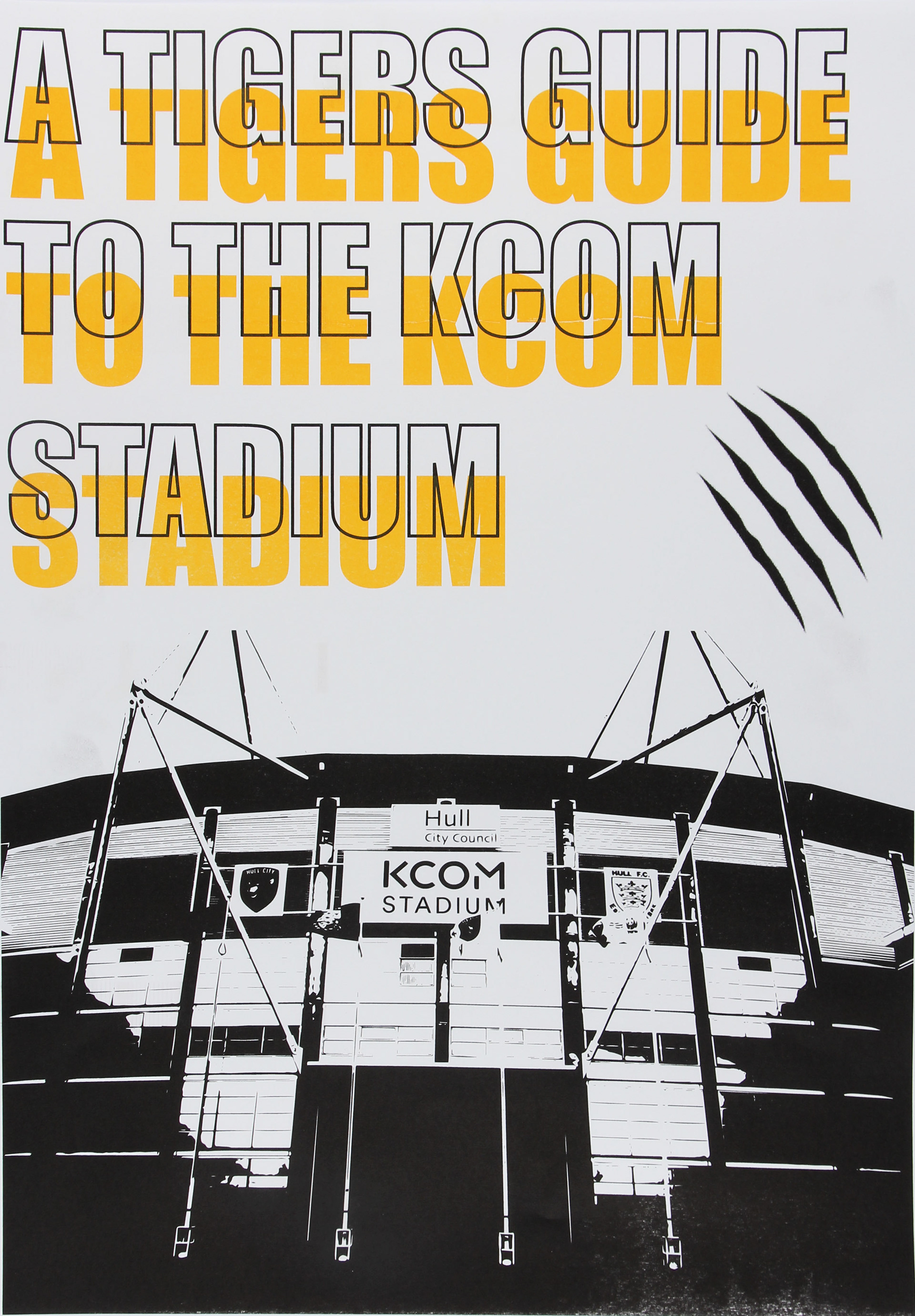
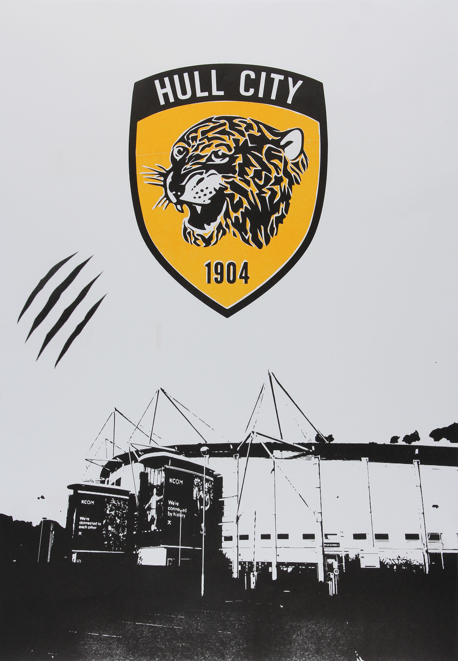
These are some A2 risograph prints I made using a combination of typography alongside my own photography. Using the black and amber colours of the club the experimental type shows the colour breaking out of the typography.

I made a programme cover design for the club and in a minimalist style using a subtle tiger print background. I wanted to include something that referenced the unique nickname of the club but in a way that was quite minimal.
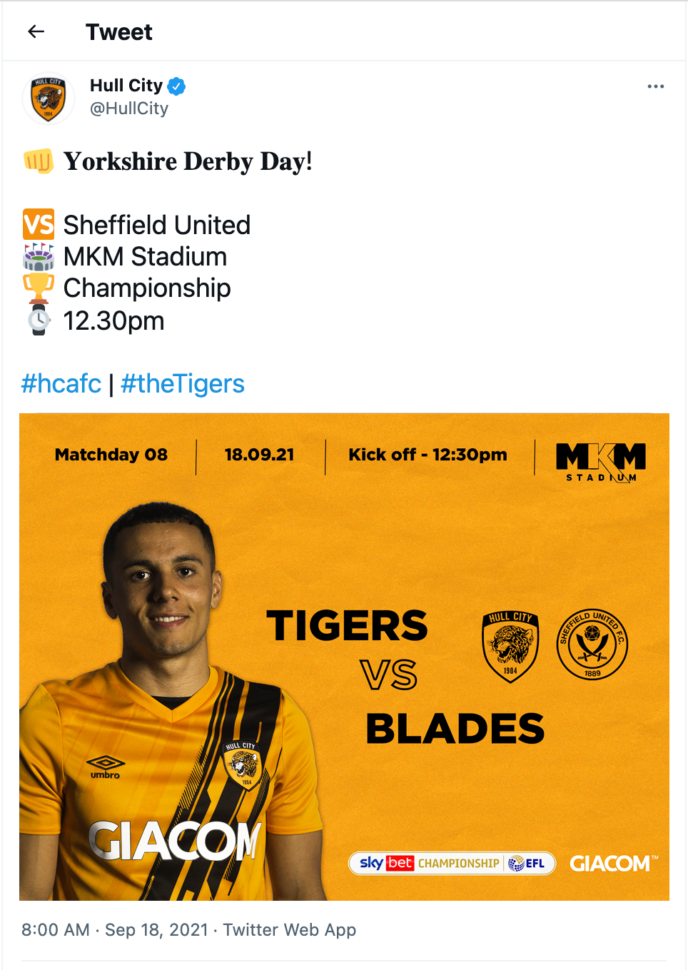
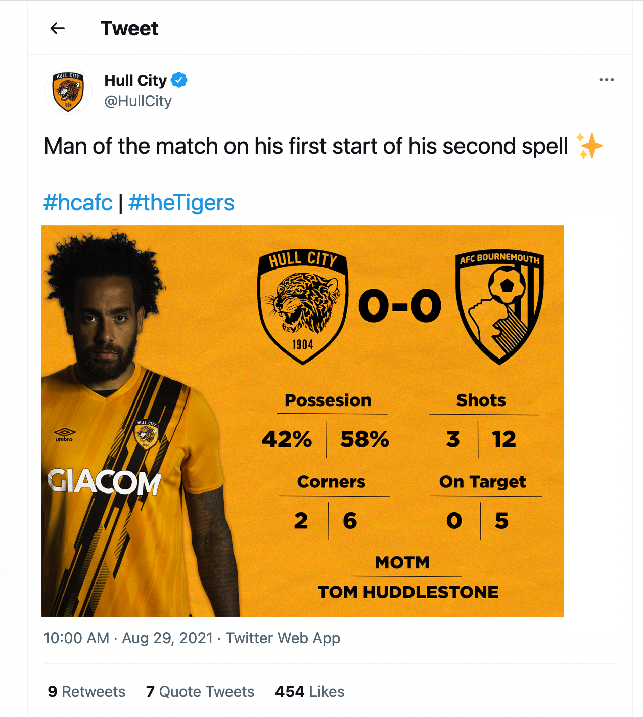
These are some designs for graphics that would be posted on the club's social media accounts on matchdays. In addition to the standard full-time graphics, I created a new one that provides statistics from the match as well as the allocated man of the match (left). I also created a pre-match graphic that follows the same visual style to make the designs coherent.
This motion piece is based around the feeling of being a supporter. It uses bold typography mixed in with clips from the club’s history or videos I took myself from my own experiences (start & end). The start and end footage is supposed to capture the experience from a fans perspective. The words chosen are ones that I associate with being a supporter of any football club.