
I created an icon to act as a logo mark for the project. I took a less literal approach with the design, however I still wanted it to be quite minimal in style. Using negative spacing I created two arrows and combined them to make the shape of a rugby ball. The arrows represent the North and South and how they are both heading in different directions to reference this divide. Its aim is to create a neutral identity that can represent both sports with this iconic shape being a main feature in both.

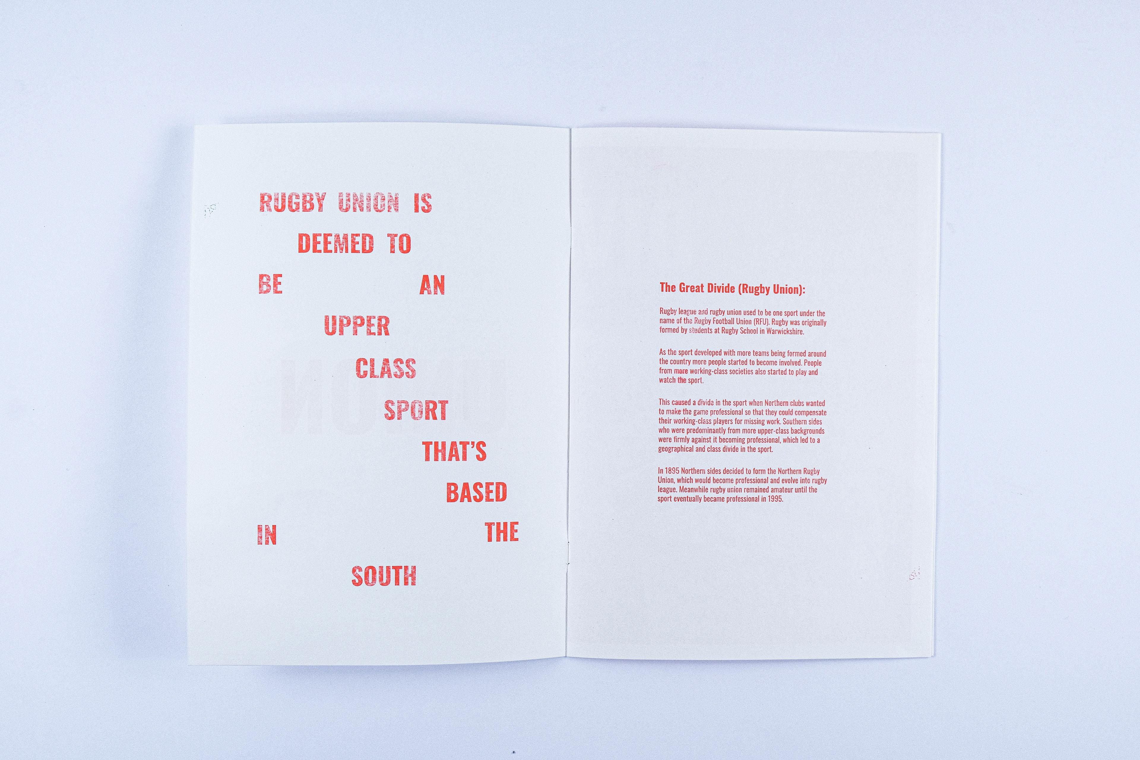
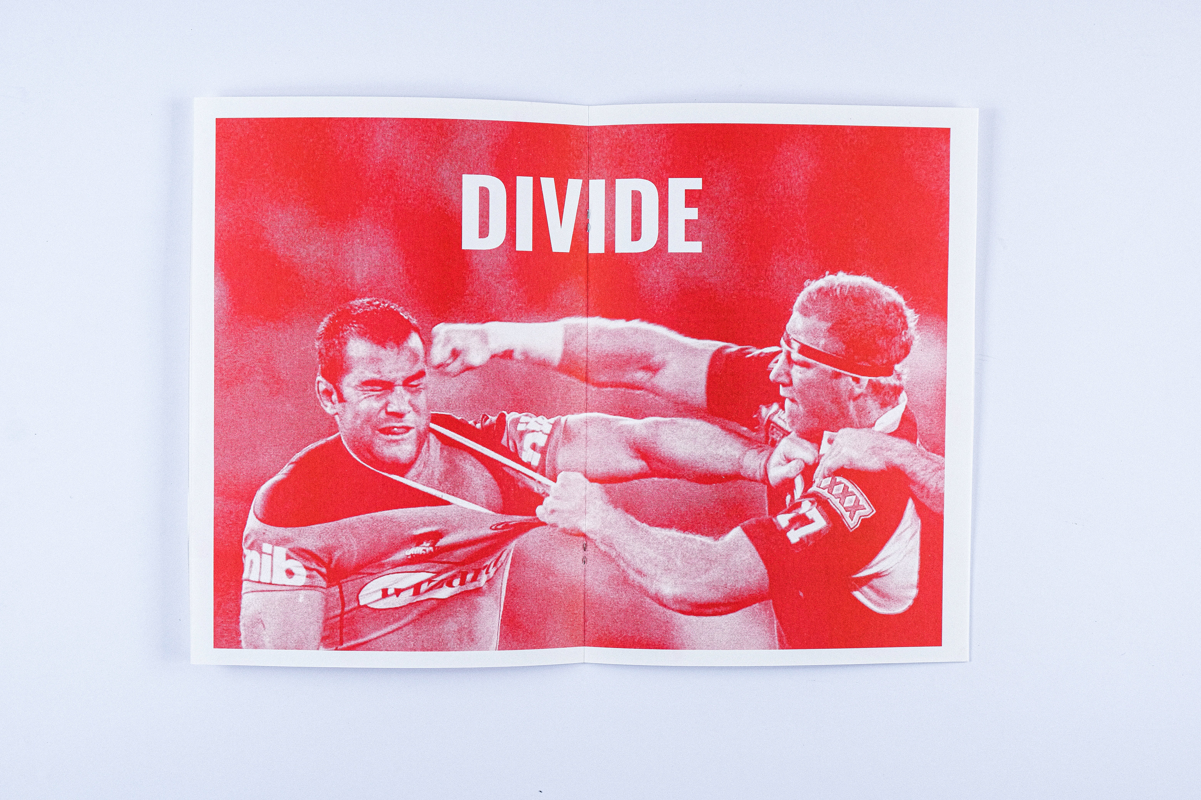

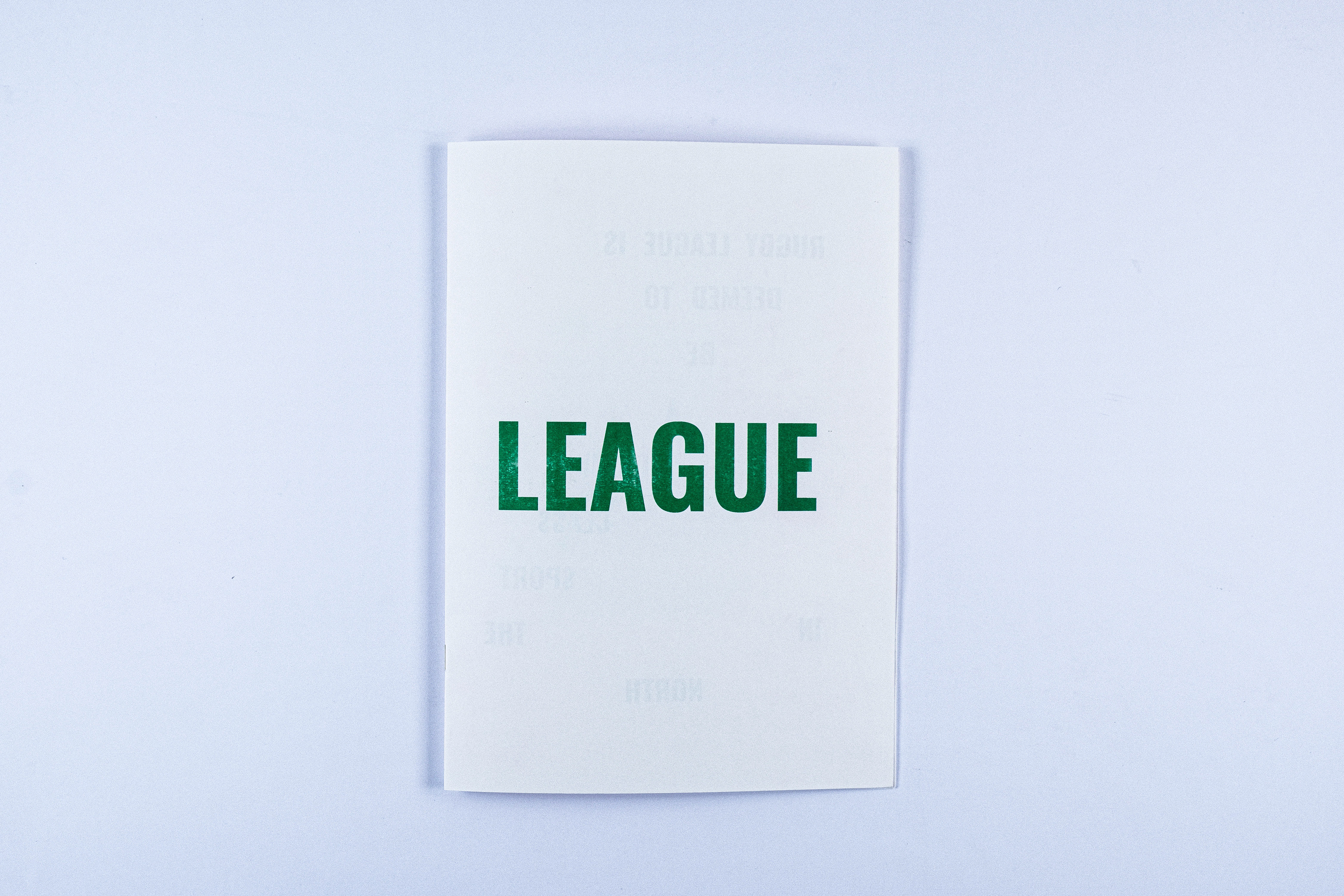
I produced an eight page risograph publication exploring the divide between the two sports. Within this I used my research behind the divide and displayed it alongside some experimental typography in the composition of each sports formation line up. When reading the publication the reader starts on the union section and once it reaches the double page spread of ‘DIVIDE’ you then flip the book and read the league section with rugby league being formed after the divide and split. However, it can be read in either order the reader chooses.
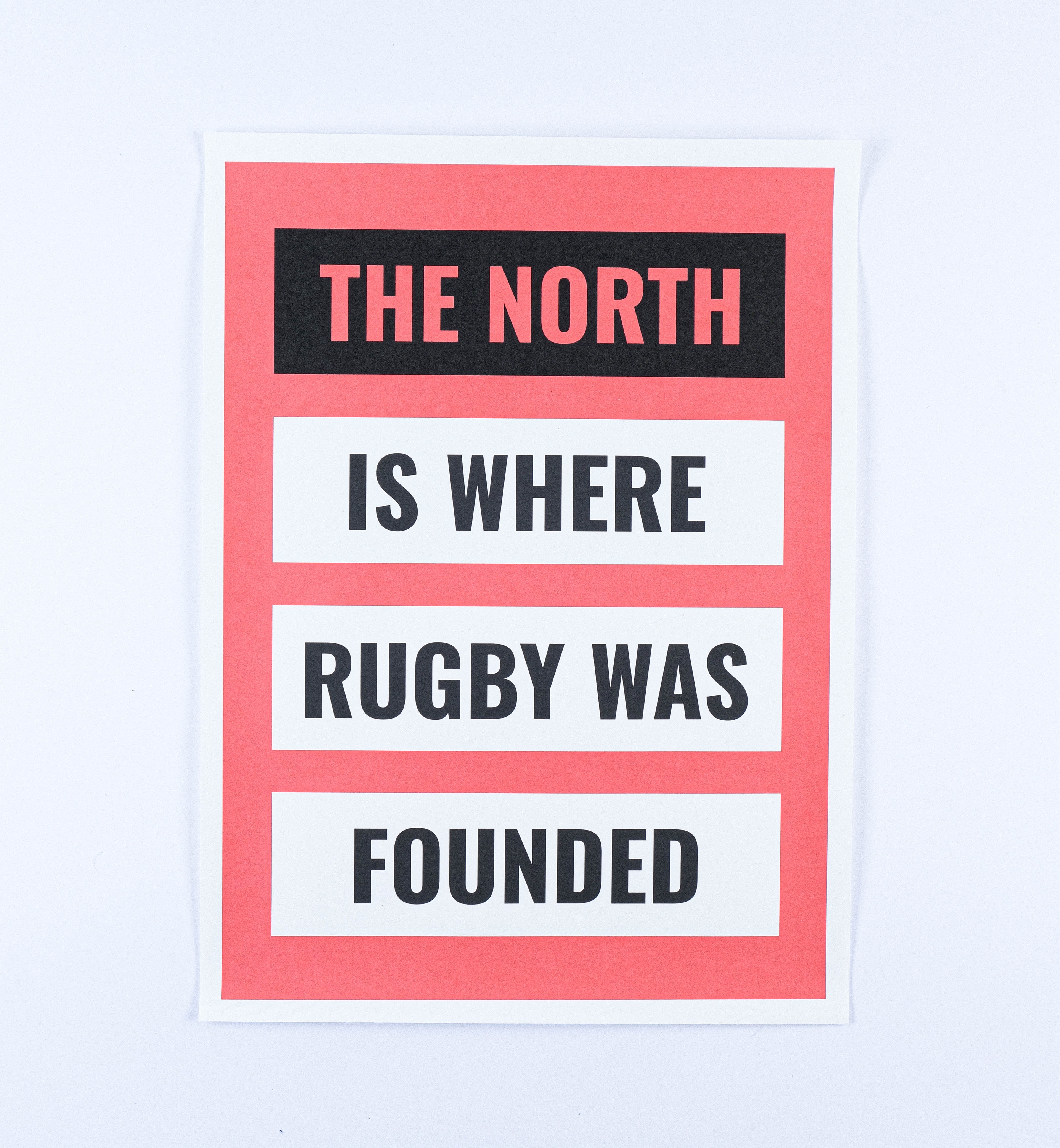
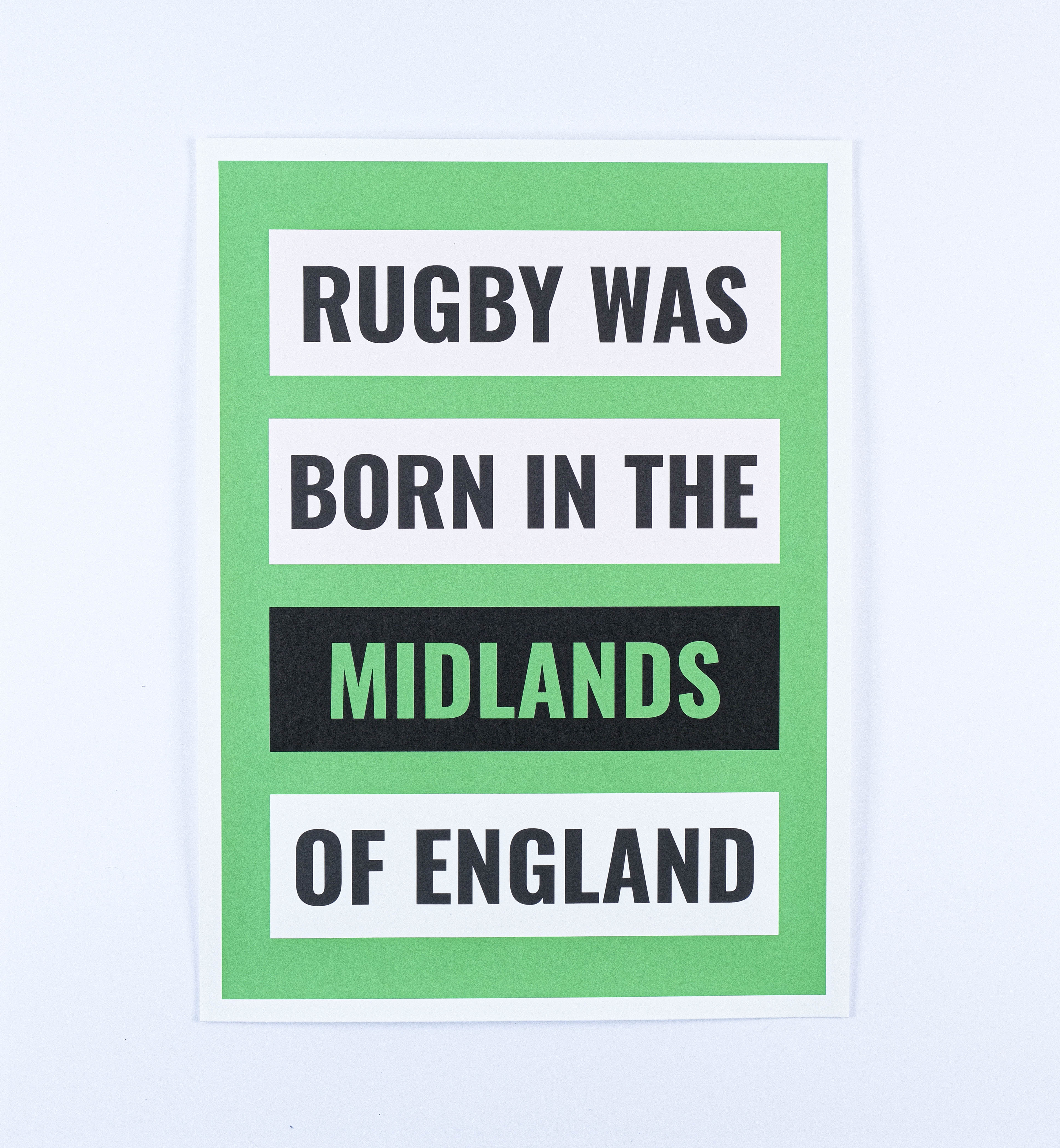

I created a series of bold typographic posters showing statements regarding the origin of rugby. The statements are worded slightly different so that the location can sit in its position. The Midlands poster is in green with this being the correct statement and that it was neither a Northern or Southern sport. The designs are inspired by newspaper headlines with this traditional forms of communication referencing this old divide that has been around for over 100 years. They're printed in shiro echo paper to try capture this newspaper style whilst keeping it not as thin as newsprint.
I animated the above posters to show the statements competing against each other to match this rivalry. It therefore shows the statements being thrown off screen and the locations barging each other out the way. The piece then lights up in green when the correct statement is shown that rugby was formed in neither the North or South.
I also created a motion timeline to visually show the history of the divide through my research. After finding key dates I put them into a sequence with matching imagery. This is accompanied with a minimal transition of the timeline bar across the screen with each date popping up on screen.